Title here
Summary here
Access the notebooks and instructions
Educational notebooks to discover, step by step, how to apply ML methods to materials data.
These notebooks are training material (version 1.0). They illustrate a practical workflow, from understanding experimental data to building predictive models and exploring more advanced approaches. They are designed as a starting point that can be adapted to your own materials data. Results depend on the quality and size of the dataset, and the choices presented are guidelines rather than universal rules.
Most notebooks include the explanations and instructions needed to understand and run the proposed workflow. You can follow them as a complete learning path, or open a specific notebook directly when you are interested in a particular step or method.
The overall workflow is illustrated below. The first steps focus on data quality and understanding; the later branches introduce prediction, model reuse, causal discovery and Bayesian optimisation. Blue boxes are the steps of the workflow and yellow boxes are the applications. The diagram also shows an optional data augmentation step, which is not covered in this guide.
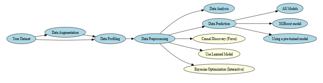
The notebooks can be followed in this order, but they are also designed to be useful independently. You can jump directly to the notebook that matches the question you want to investigate. The index notebook (notebooks/index.ipynb) links to the main notebooks.
You need one of the following: Apptainer, Docker, or Python 3.10+ with uv and Graphviz. Detailed instructions are available in the tutorial repository.
First step: check the quality of the starting dataset.
Notebook: preprocessing.ipynb
This notebook helps you spot data quality problems before analysis or modelling.
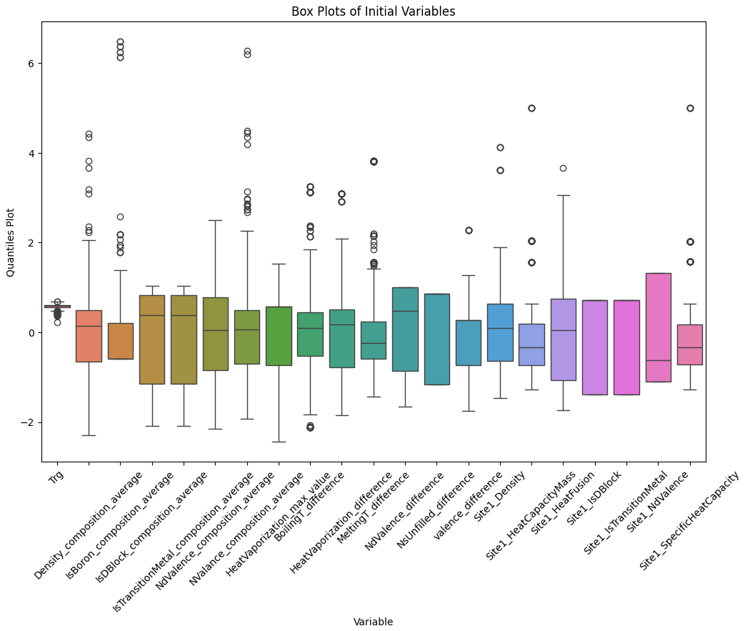
Steps:
Outliers are not necessarily errors
An outlier is not necessarily an error: it may be a genuine measurement. Look at the flagged rows before deciding to remove them.
Getting a first idea of the structure of the data, without trying to predict a target.
Notebook: analysis.ipynb
An introduction to a few unsupervised methods: correlations, dimensionality reduction and clustering.
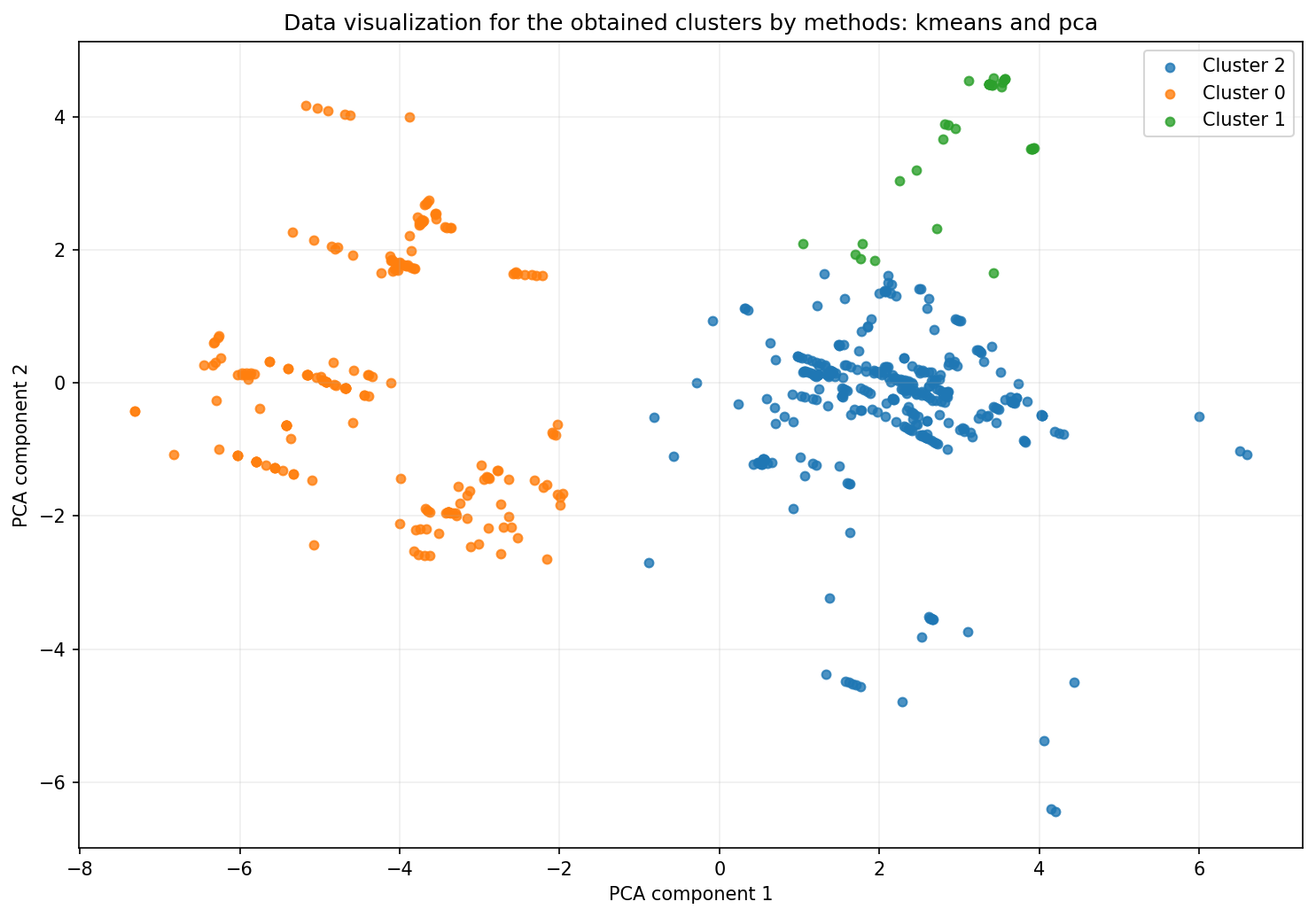
Steps:
Profile the dataset.
Compute the correlations and read them on the heatmap.
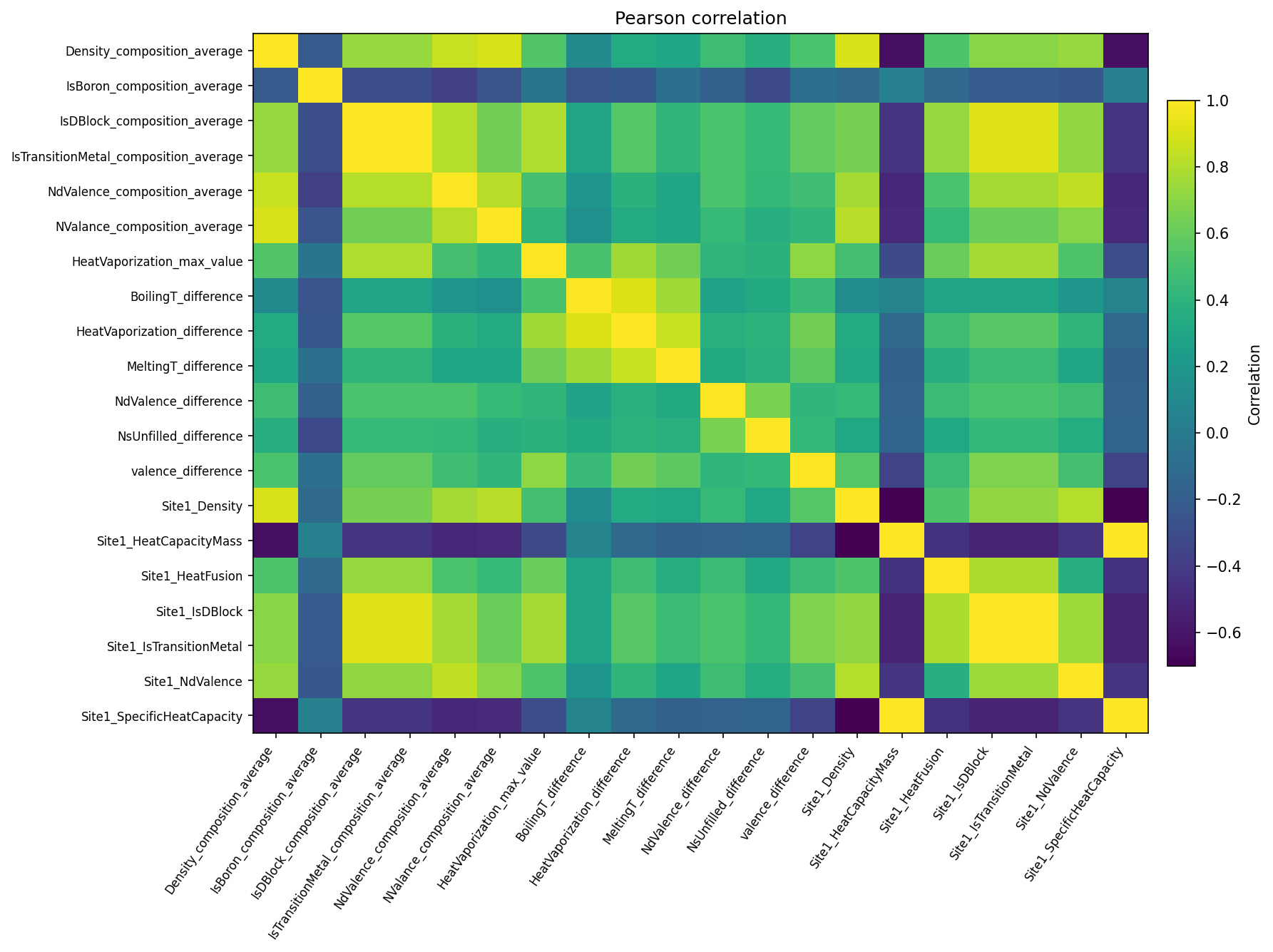
Reduce the dimension with a principal component analysis (PCA): follow the cumulative explained variance and choose the number of components according to a threshold, for example 90 or 95%.
Try a clustering method (K-Means, agglomerative or DBSCAN) and adjust its hyperparameters.
Project the groups, compare their centres, then export the data with a cluster identifier column.
Example. Notice that two strongly correlated variables carry almost the same information, then check with PCA whether a few components are enough to represent the dataset.
Clusters depend on the method
Clusters depend on the method and its settings: compare several methods rather than treating one result as final.
Relating a target variable to explanatory variables, or reusing an already saved model.
Notebook: modeling_all.ipynb
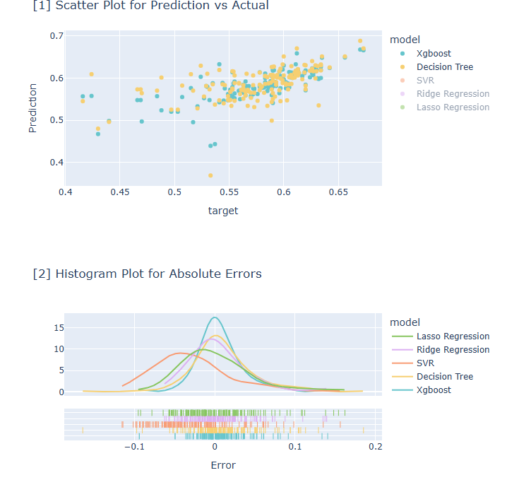
A guide to predicting a continuous variable with several algorithms and comparing their results. Each algorithm comes with hints on when to consider it.
Steps:
Example. On a dataset where the relationship looks linear and the variables are correlated, compare Ridge or Lasso with XGBoost. The export can be named by version and dataset, such as models_V01_metallic_glass.
Model choice stays empirical
Choosing a model remains an empirical comparison: the hints given are guidelines.
Notebook: modeling_xgboost.ipynb
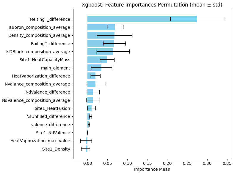
A closer look at XGBoost, which builds trees in sequence, each one correcting the errors of the previous ones, to understand the effect of its settings.
Steps:
Example. Compare the metrics of the default model and the optimised model to judge whether the grid search brings a noticeable gain on your dataset.
Platform limitation
XGBoost grid search is not supported on Windows in local mode.
Notebook: modeling_prediction.ipynb
Shows how to reuse a model saved in .pkl format on new data, without retraining.
Steps:
.pkl).Example. Apply a model exported from a modelling notebook to a new batch of samples, checking that its input variables match.
Notebooks that illustrate more advanced approaches on a concrete case. They are examples of an approach, to be transposed to your own systems. Retraining the models is possible but optional, and is described at the end of this section.
The data. Each sample links synthesis parameters to an optical response.
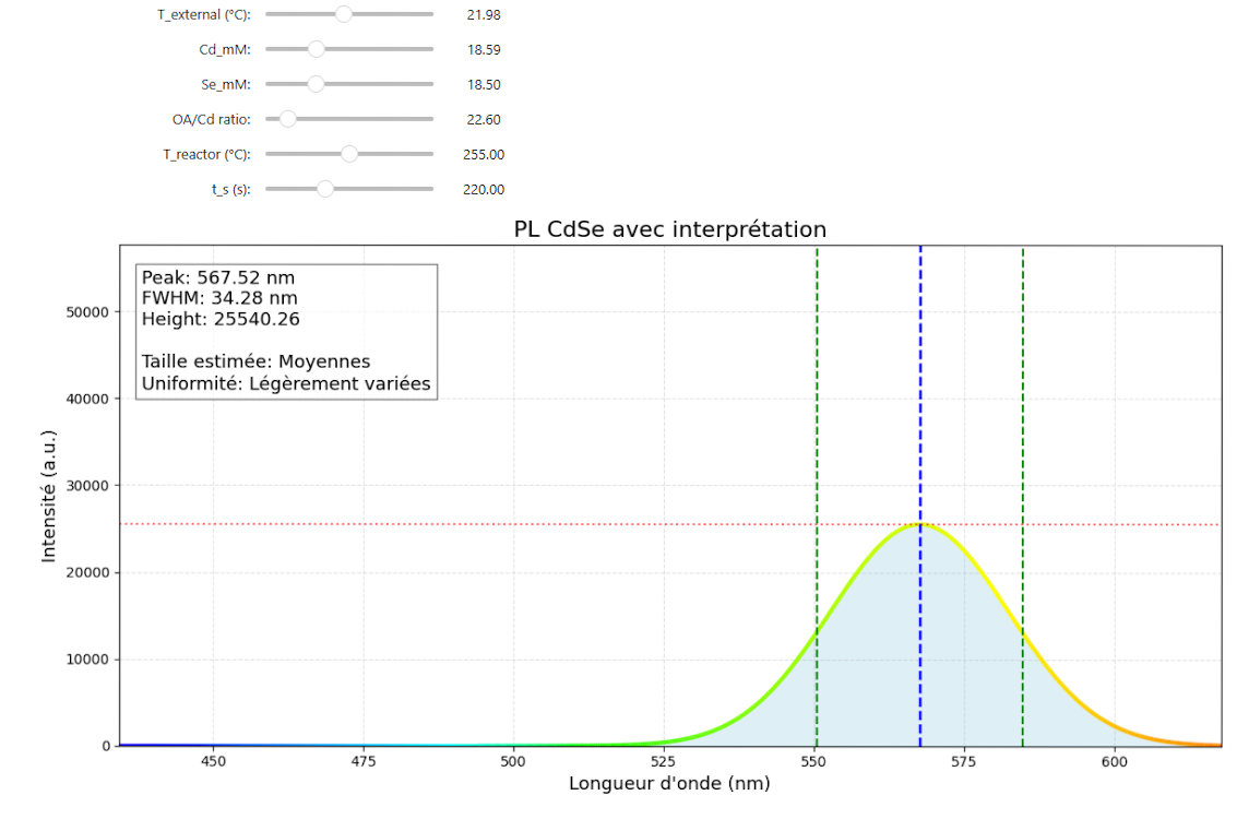
T_external (external temperature), Cd_mM and Se_mM (precursor concentrations), OA_Cd_ratio (ligand-to-metal ratio), T_reactor (growth temperature), t_s (reaction time).Peak_nm (emission peak, related to the average size), FWHM_nm (spectral width, related to uniformity) and height (intensity).Notebook: Use_Learned_Model.ipynb
Loads pre-trained models and offers an interface to explore their predictions.
Steps:
Example. Fix a combination of parameters, predict with the random forest and then with the Gaussian process, and compare the two spectra.
Notebook: Causal_Discovery_Force.ipynb
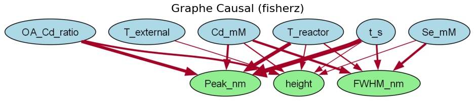
A demonstration of causal discovery with the PC (Peter–Clark) algorithm, from observational data.
Steps:
CdSe_PL.csv by default).Example. Compare the graphs obtained with Fisher Z and with KCI to see which links depend on the linearity assumption.
A graph is a hypothesis
A graph obtained from observational data is a hypothesis to be checked against domain knowledge, not proof of causality.
Notebook: Bayesian_Optimization_interactive_short.ipynb
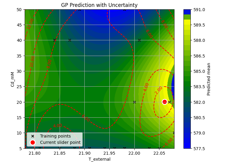
Illustrates the principle of Bayesian optimisation: a Gaussian process proposes the next conditions to test and updates itself with the measurements. It lends itself to teaching as well as to experimentation.
Steps:
Notebook: Learn_Models_RF_GP.ipynb
Explore the learned model uses models that have already been trained. If you want to understand how they are built, or rebuild them, this notebook trains a multi-output random forest and a Gaussian process with a Matérn kernel on the CdSe data, then saves the models with their normalisations. It is not required to follow the rest.